Havells One Design System v1.0
OBJECTIVE
To bring into existence a Design-System for the Havells One app. This involved moving the Design and Development teams away from screen-based design toward a token based Single Source of Truth approach.
ROLE
UX Architect and Subject Matter Expert. Guiding a team of 3 junior designers, 2 senior designers, 2 third party design teams on best practices for scalability.
ABOUT HAVELLS ONE
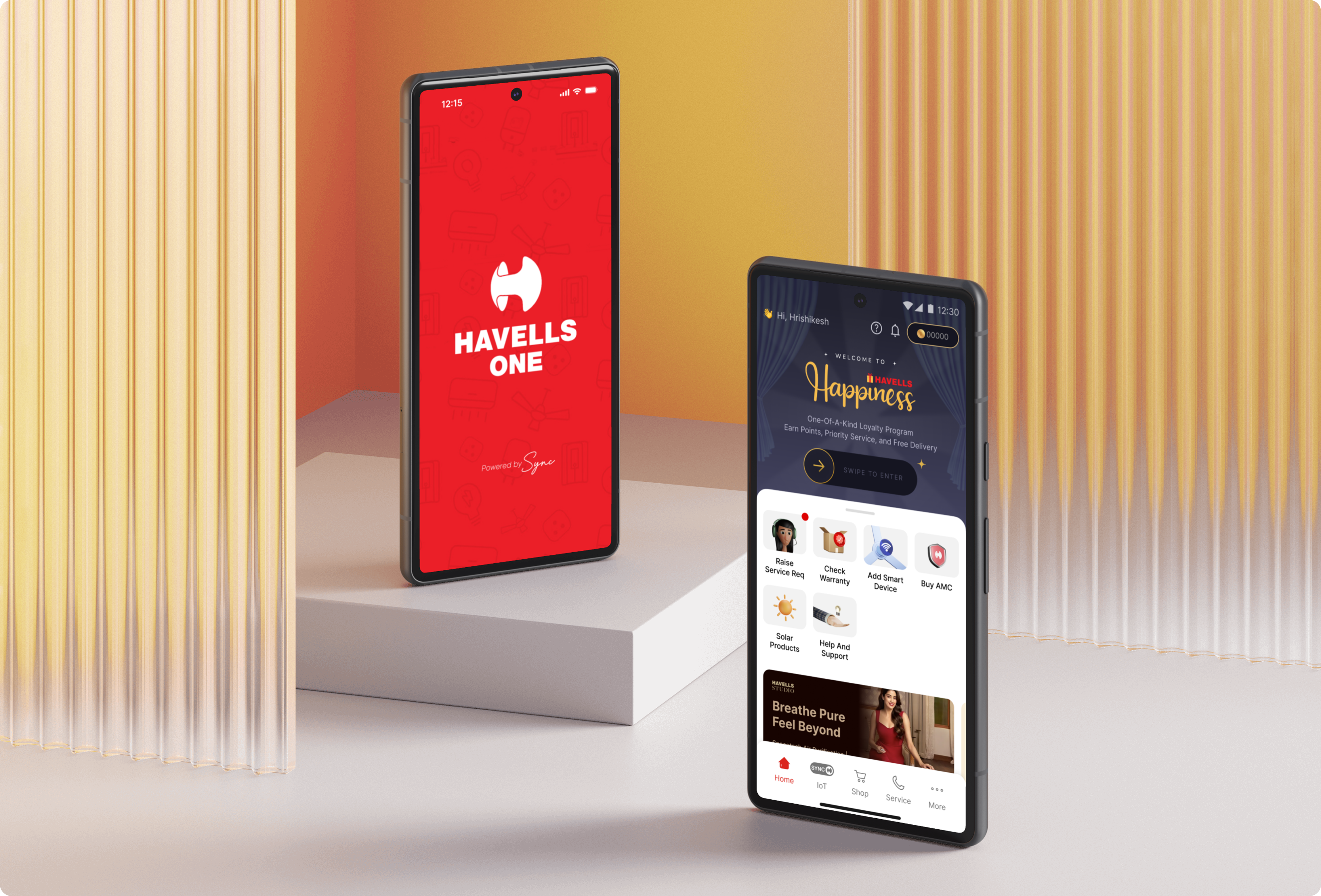
Havells One is the flagship ecosystem app from Havells. It has over 1 million users controlling their homes, buying appliances, and accessing after sales services.
The challenge was to build a scalable language that could represent 5 different sub-brands in a unified manner, i.e. Havells, Lloyd, Standard, Crabtree, and Havells Studio.
THE PROBLEM — WHY WE NEEDED A DESIGN SYSTEM
THE BEFORE STATE
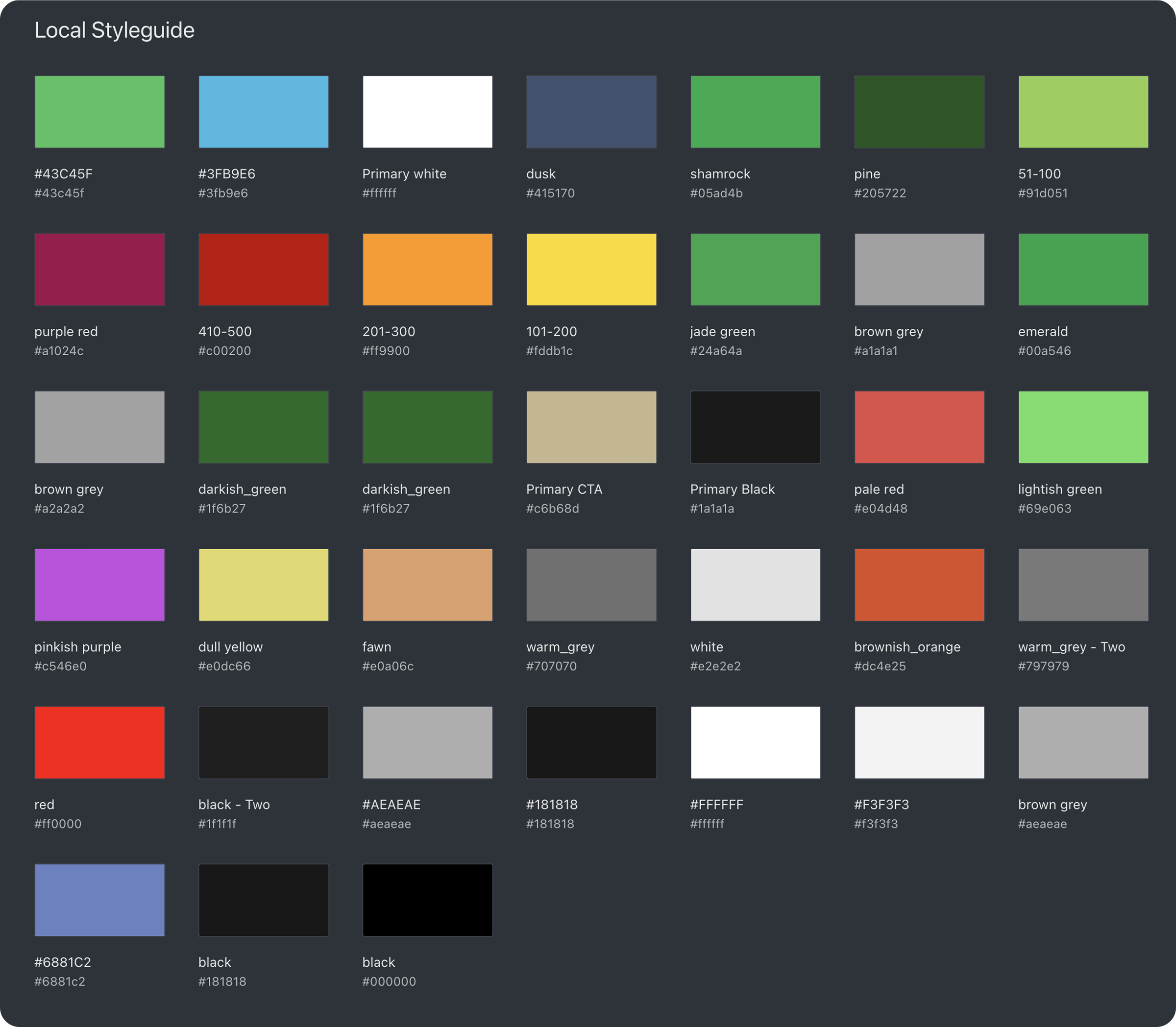
When I joined Havells in 2021, the level of inconsistency and fragmentation in was quite apparent. We had an undefined, unstructured colour library where dozens of nearly identical shades of colours lived side-by-side.
Accessibility was largely treated as a 'High-investment Low-value' task.
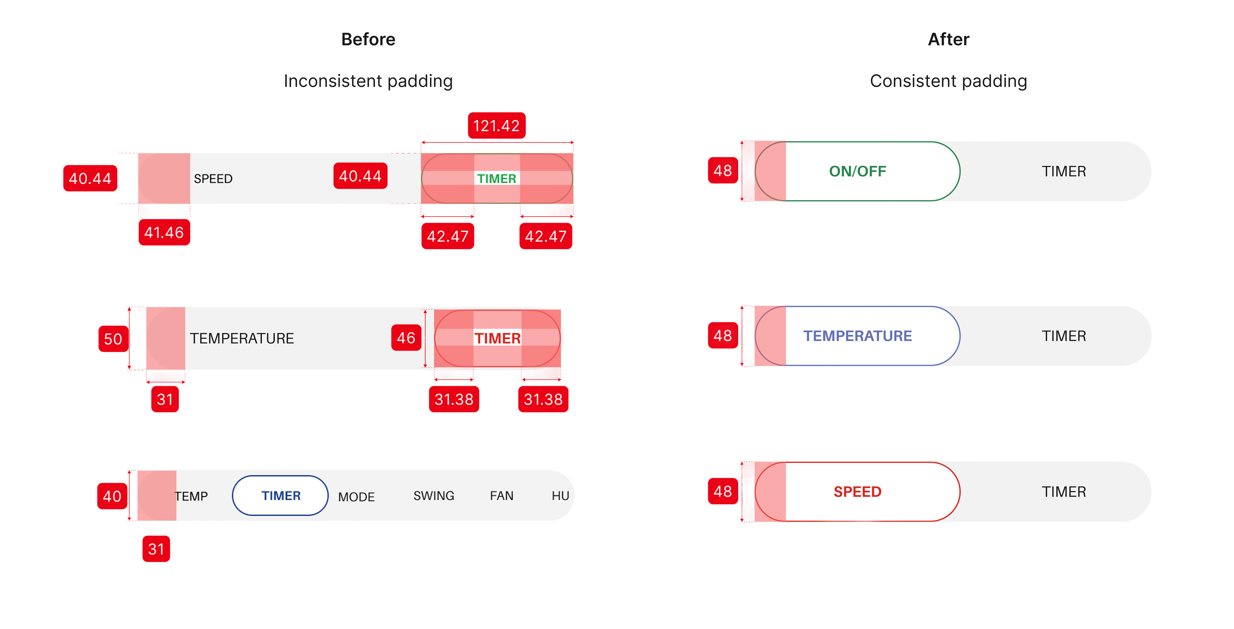
Up-close, there was massive inconsistency in treatment of colour, spacing, type, IA, and components across products and brands.
When I started talking to my peers it was clear that the entire design and dev team was frustrated, trapped in a loop of reactive fixes instead of proactive building.
BUSINESS IMPACT
DESIGN IMPACT
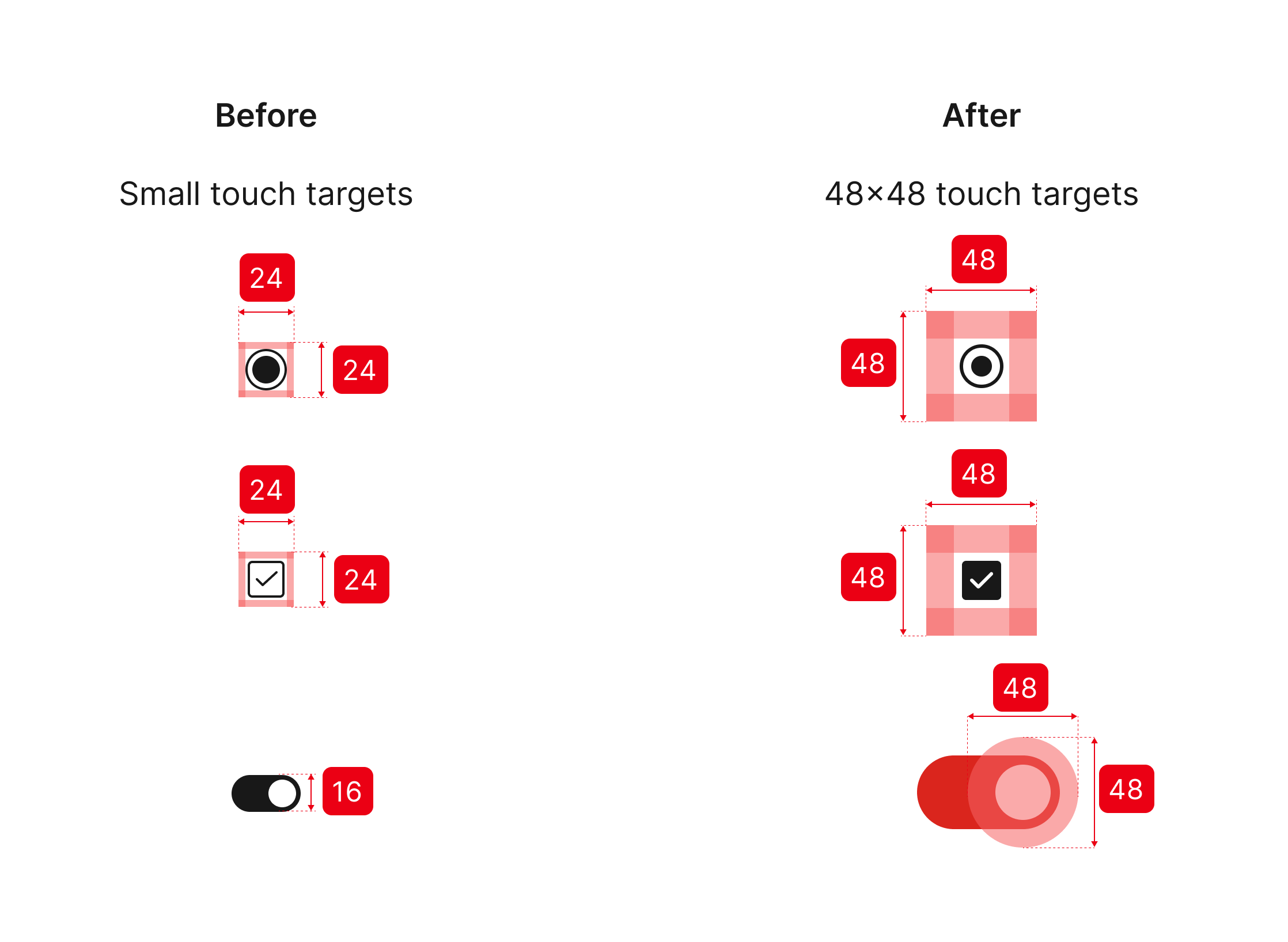
Accessible Touch Targets
Consistency Across Components
LAYING THE FOUNDATIONS
All the components of Havells One design library are built using the foundational elements. These include:
- Typography
- Colours
- Icons
- Space
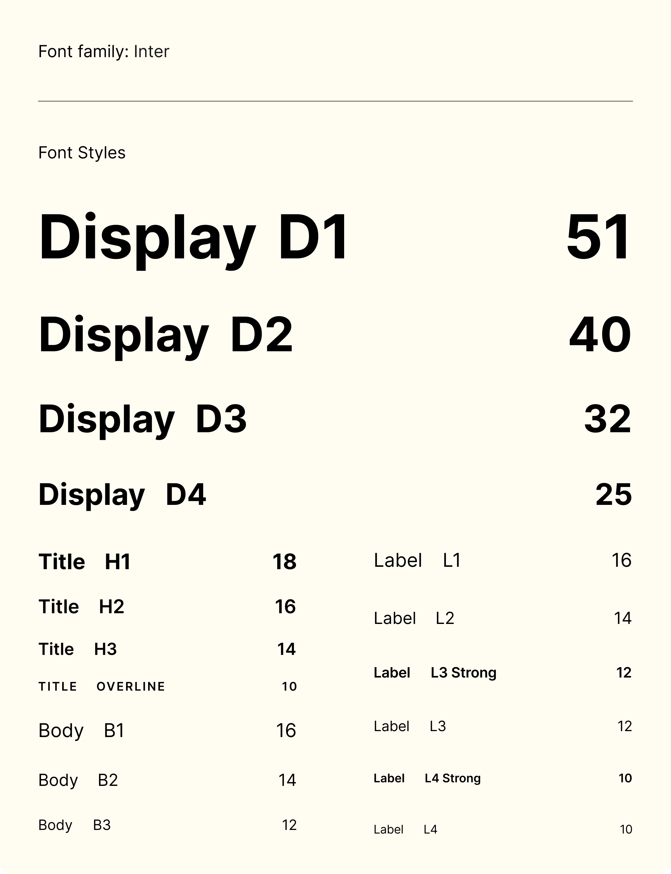
Typography
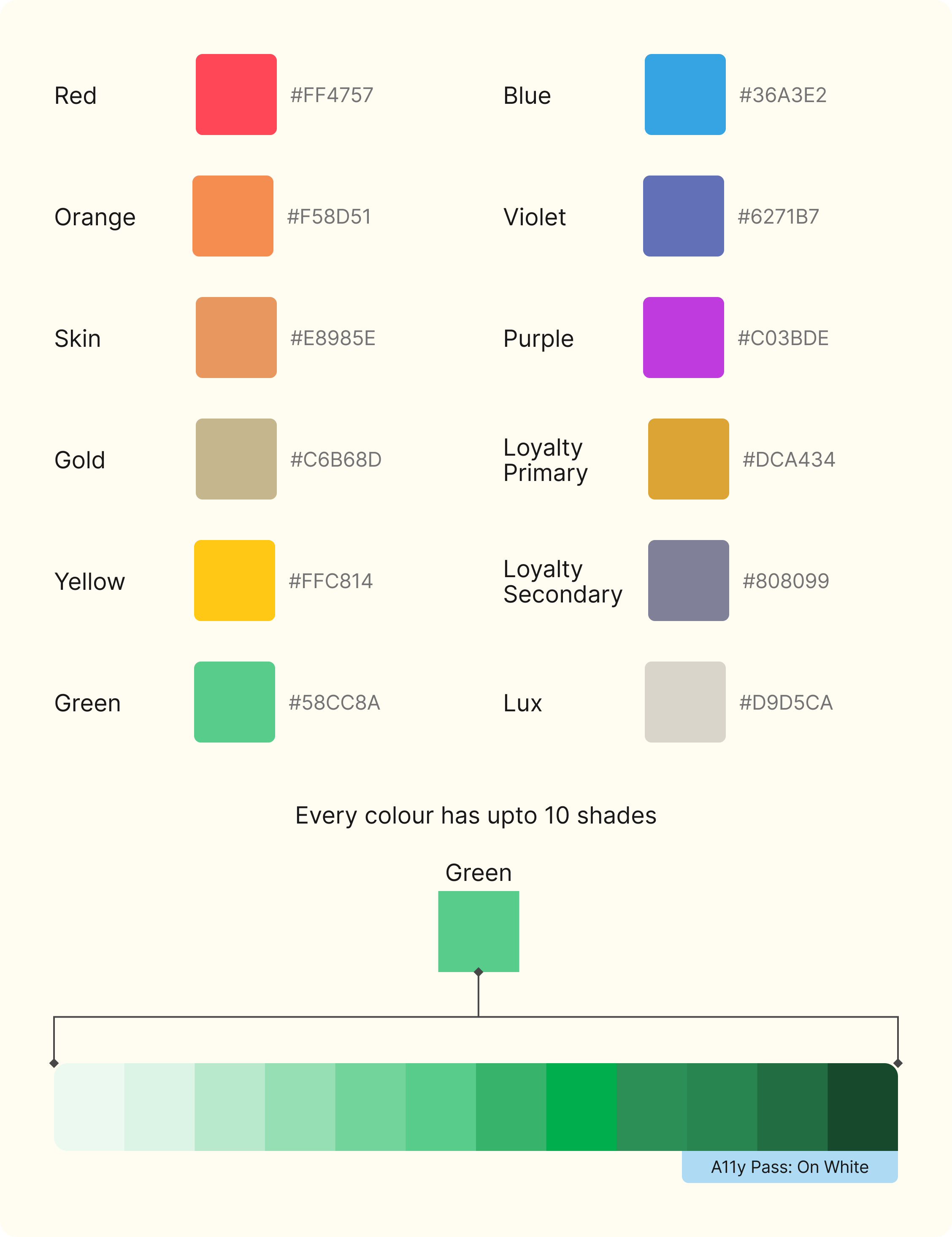
Colours (primitive)
Icons
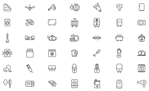
For icons we followed the Material design icon library. If any new icon were to be added it will follow the following specs: Optical size (default): 24dp Weight: 300 Rounded
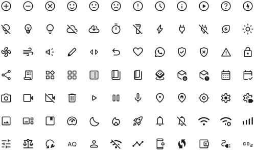
Our library also included custom icons.
Numbers
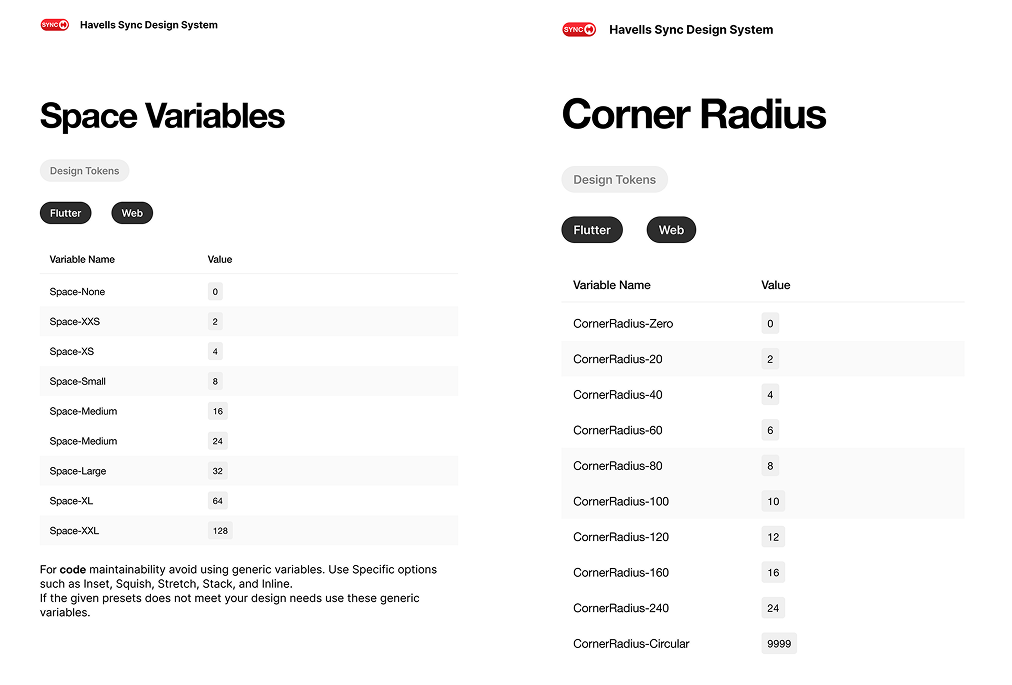
| Variable Name | Value |
|---|---|
| Space-None | 0 |
| Space-XXS | 2 |
| Space-XS | 4 |
| Space-Small | 8 |
| Space-Medium | 16 |
| Space-Medium | 24 |
| Space-Large | 32 |
| Space-XL | 64 |
| Space-XXL | 128 |
| Variable Name | Value |
|---|---|
| CornerRadius-Zero | 0 |
| CornerRadius-20 | 2 |
| CornerRadius-40 | 4 |
| CornerRadius-60 | 6 |
| CornerRadius-80 | 8 |
| CornerRadius-100 | 10 |
| CornerRadius-120 | 12 |
| CornerRadius-160 | 16 |
| CornerRadius-240 | 24 |
| CornerRadius-Circular | 9999 |
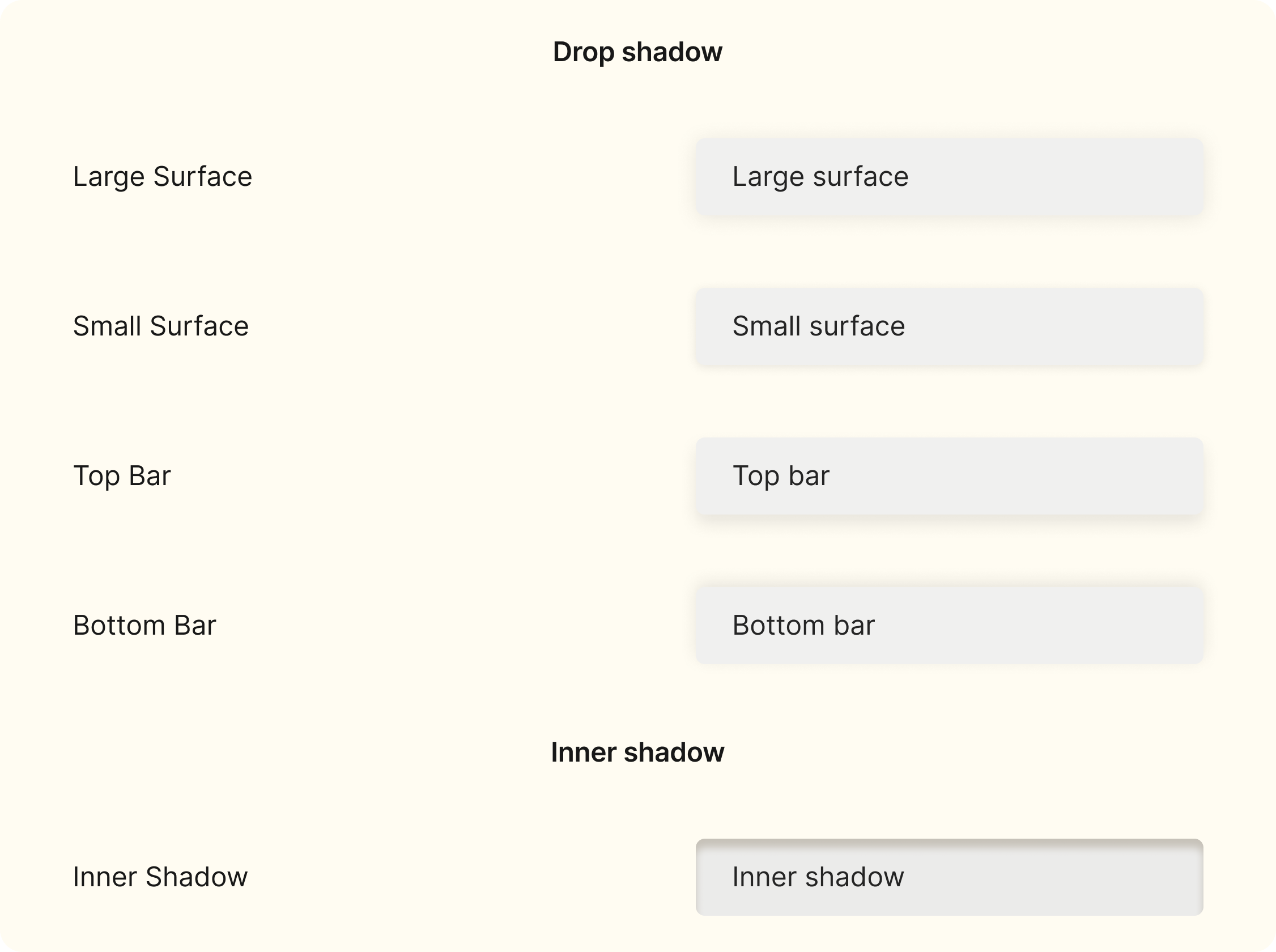
Effects
COMPONENTS
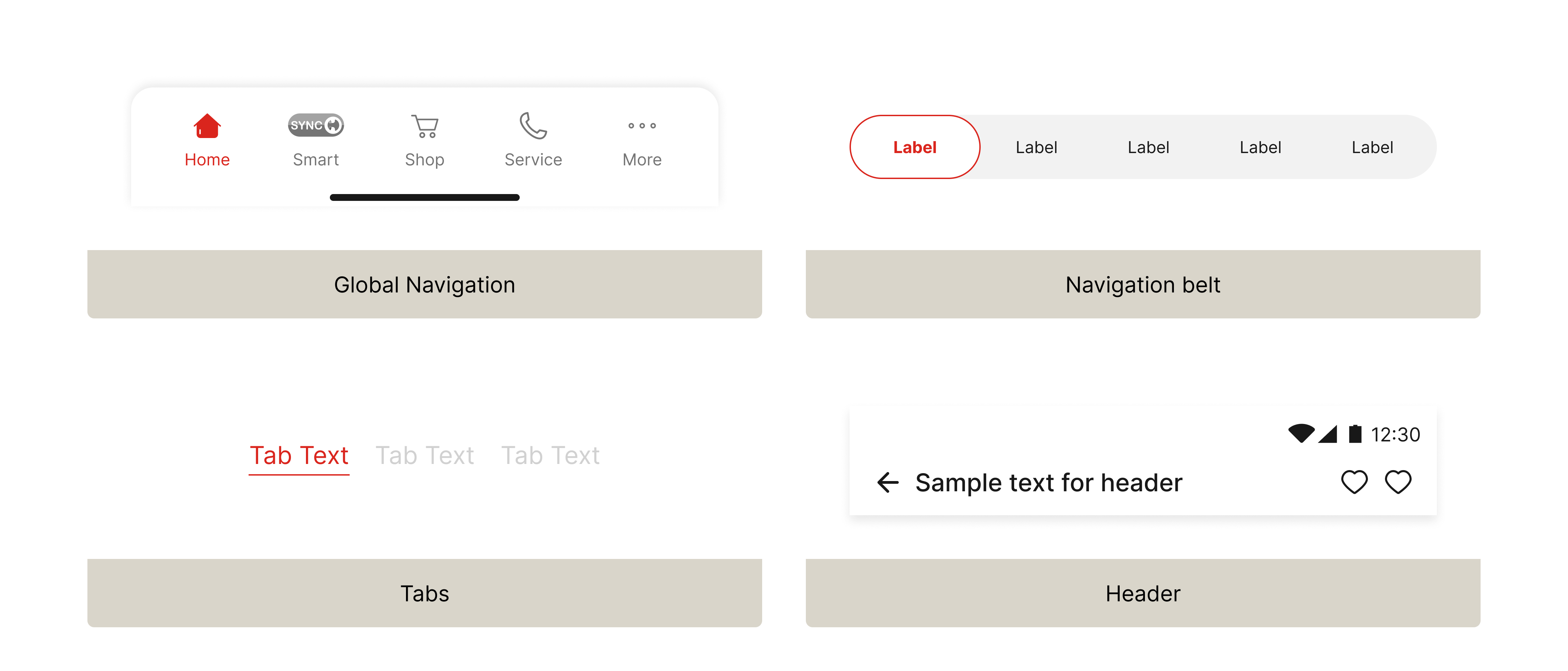
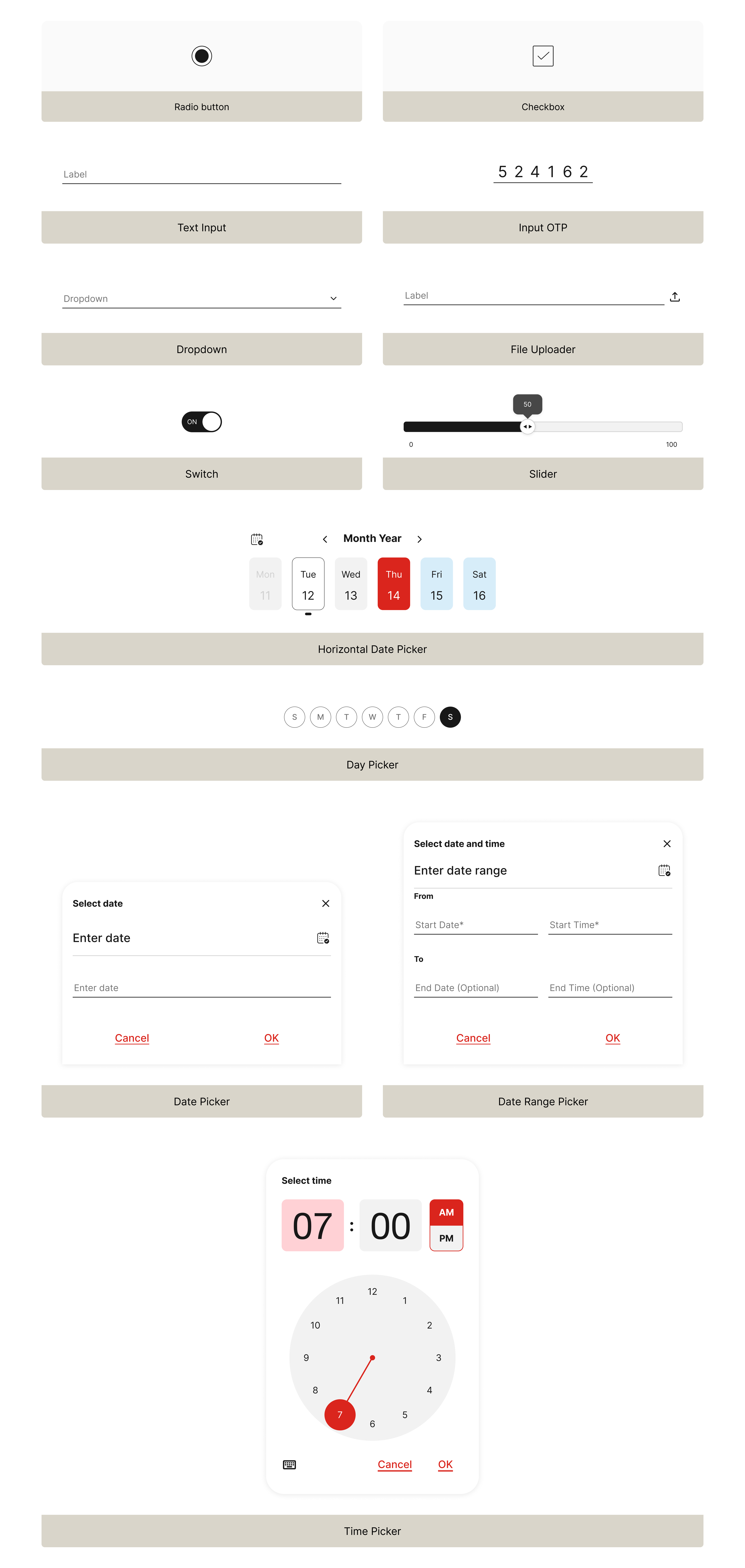
Havells design system v1.0 consisted of 26 components.
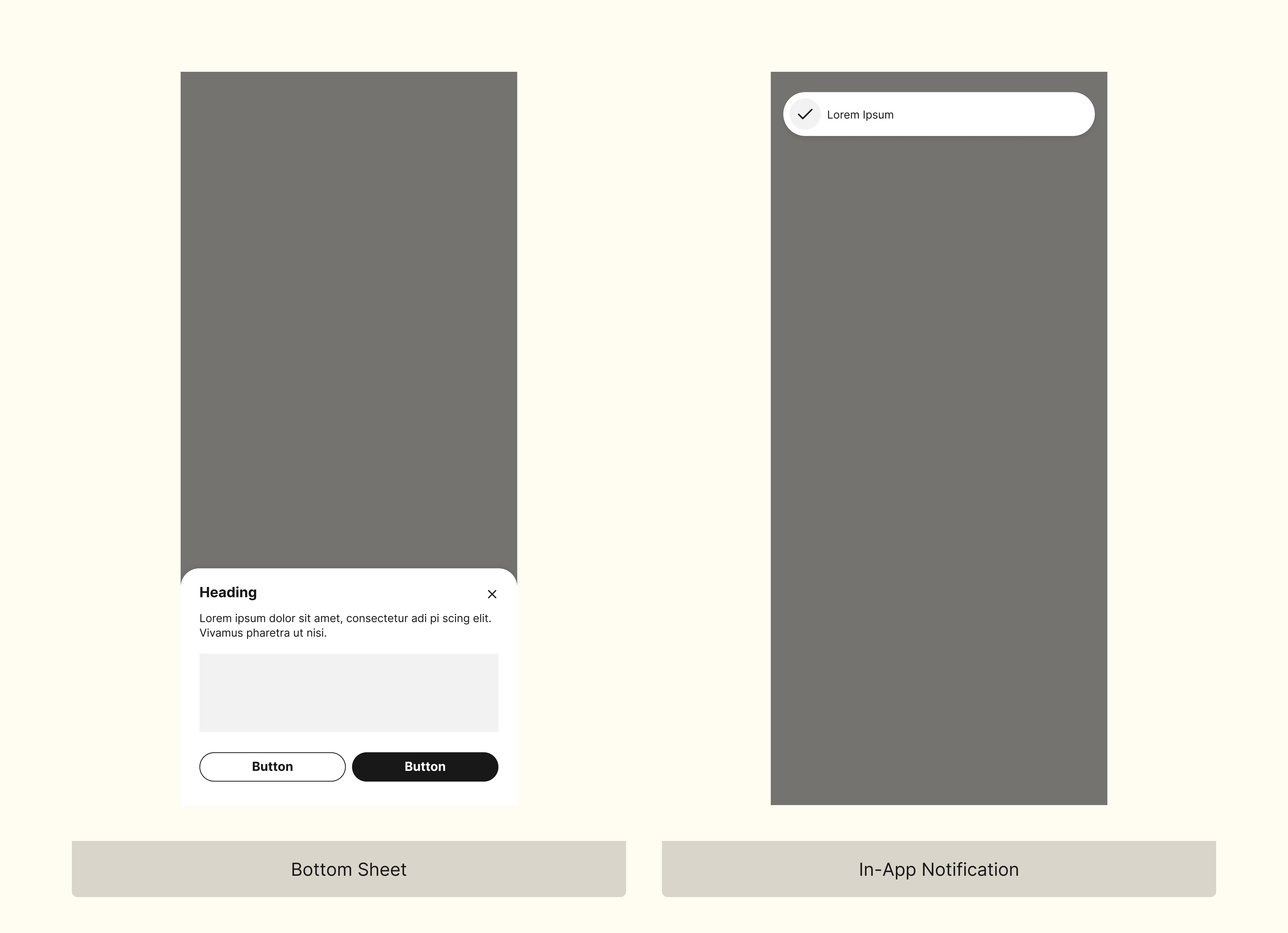
Dialogues
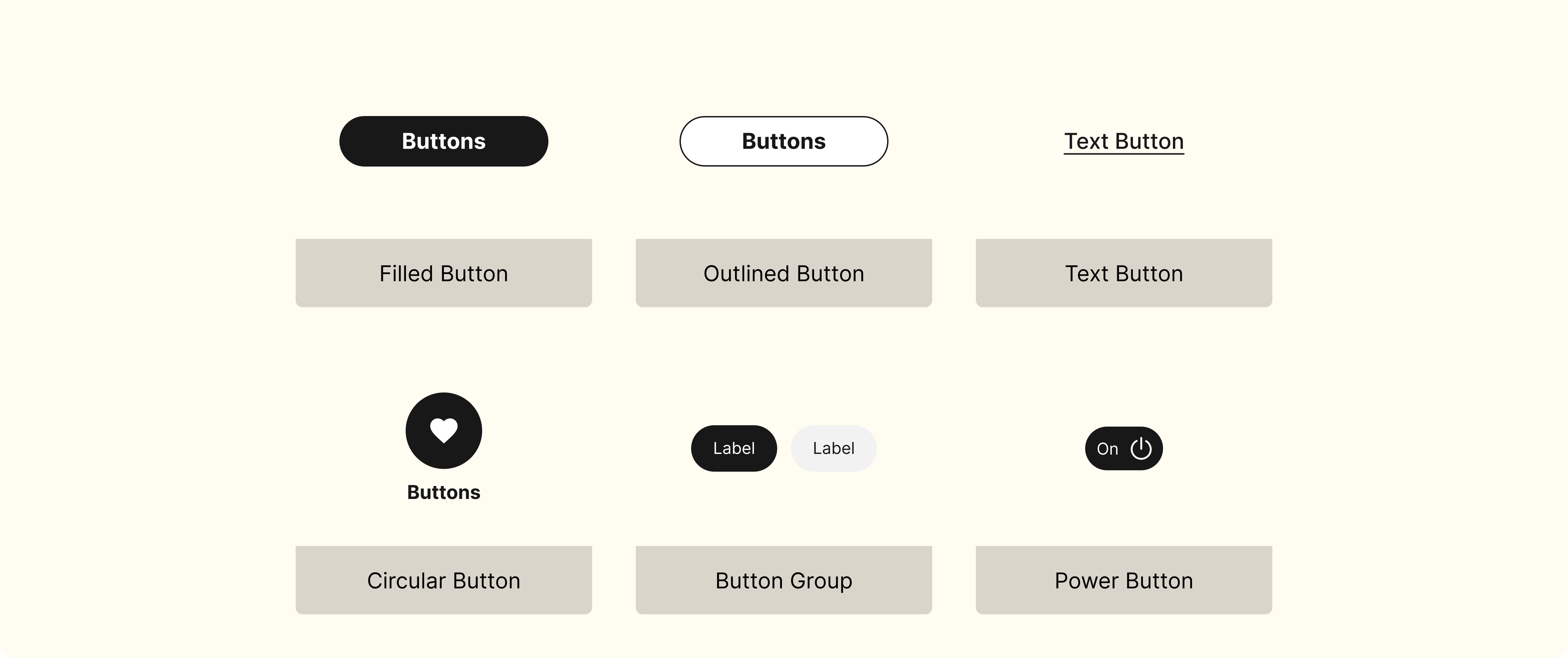
Buttons
Navigation
Input
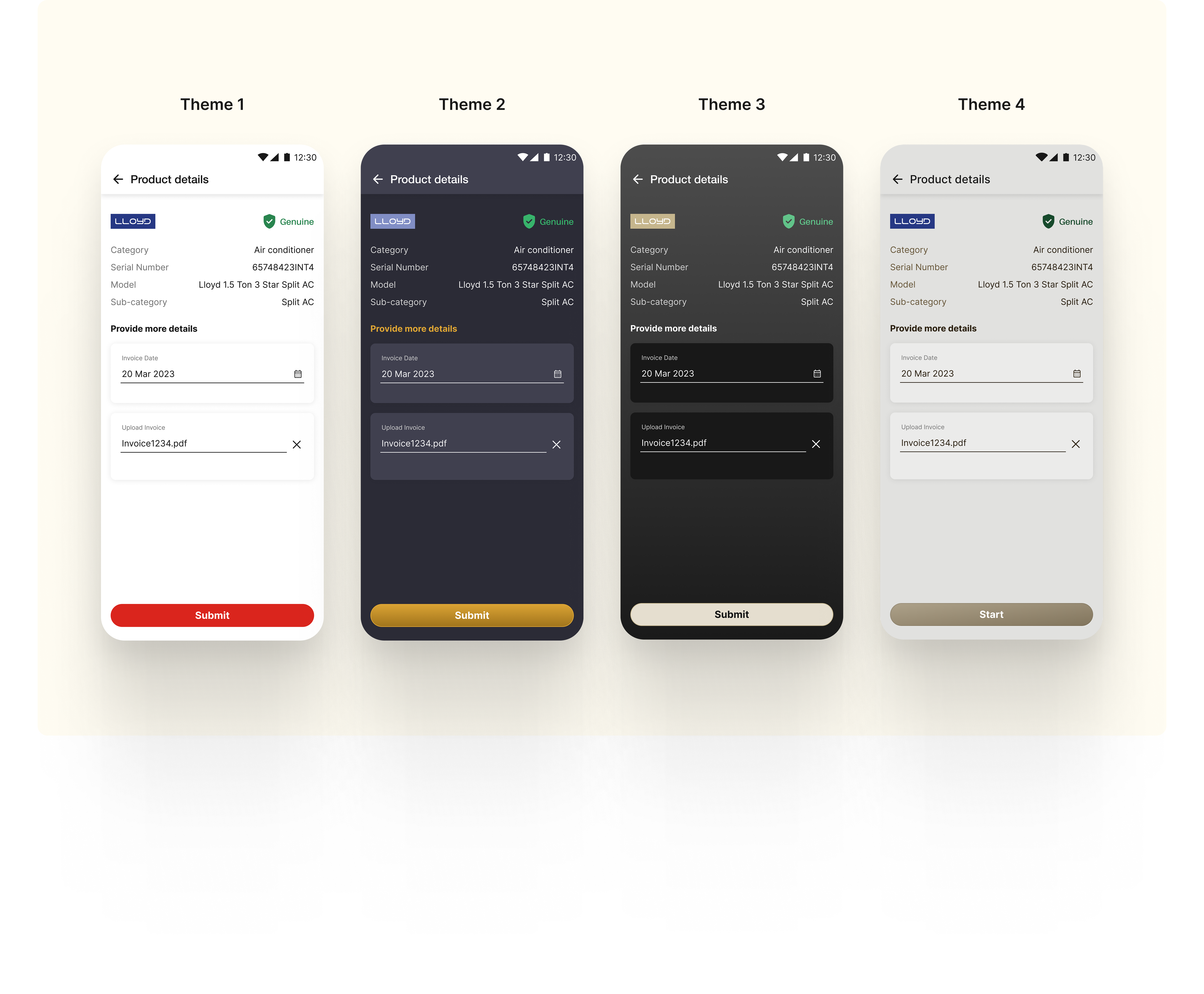
THEMES
Every component is further made in 4 different themes.
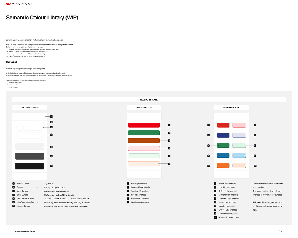
HOW-TO DOCUMENTS
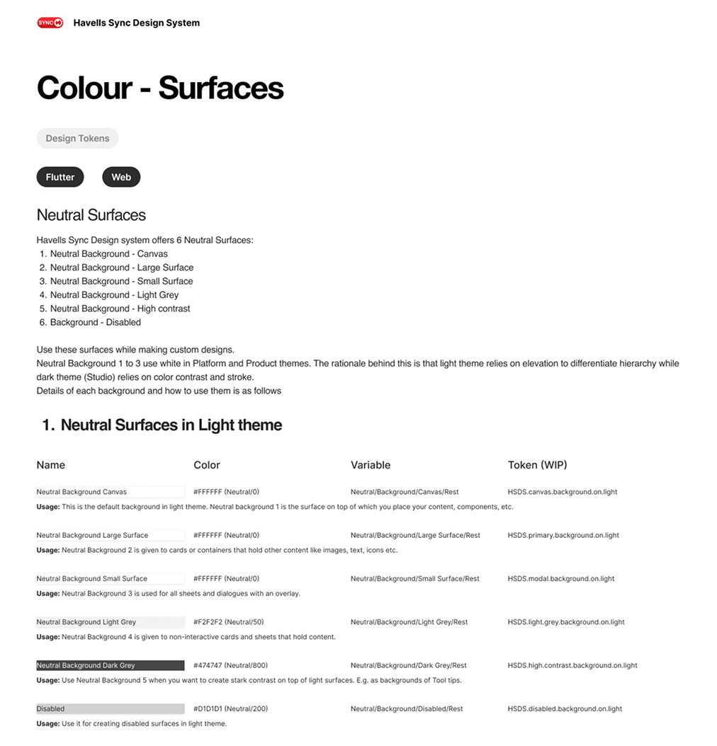
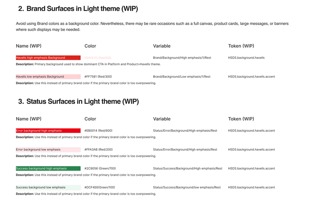
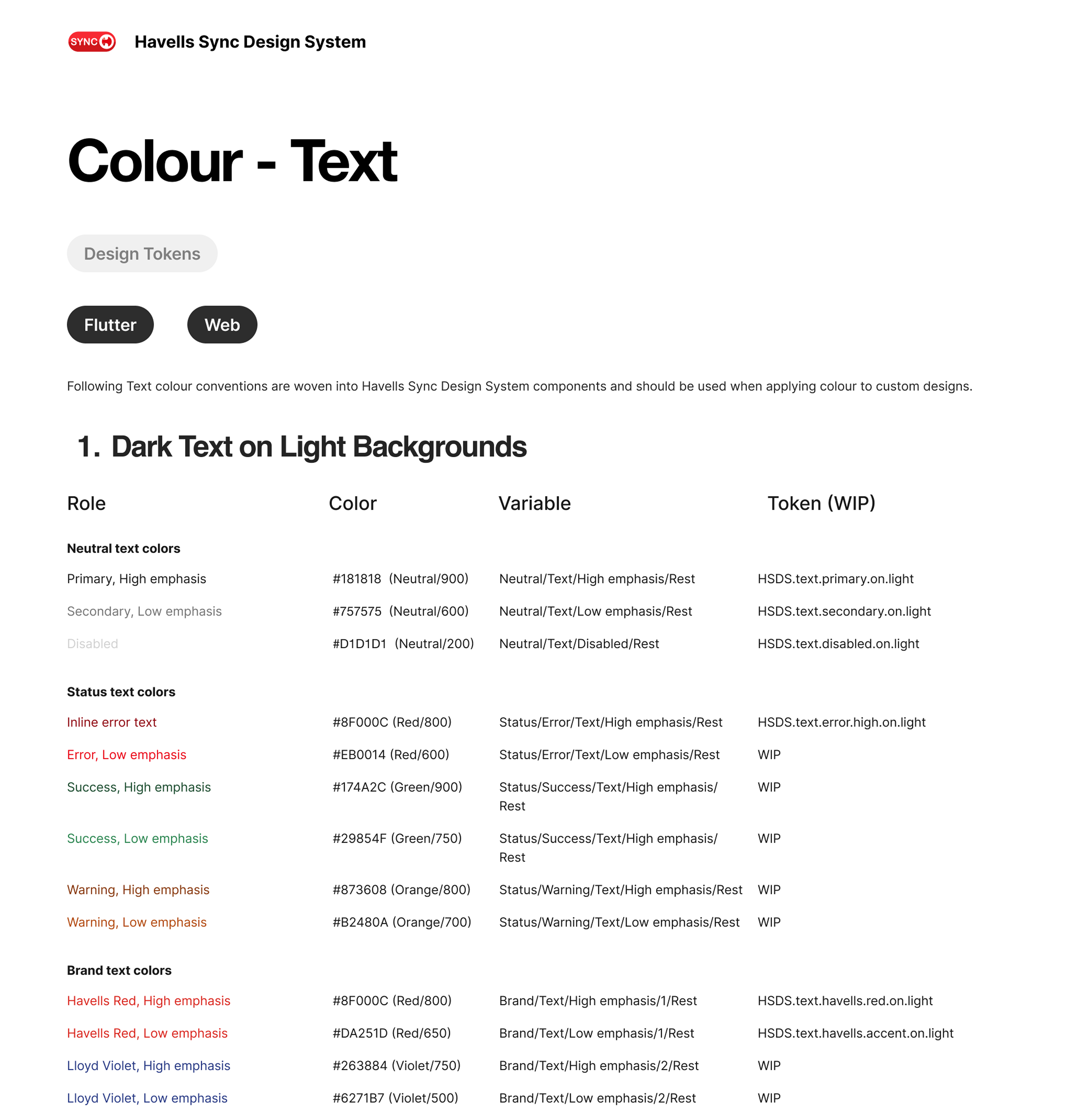
I authored comprehensive 'How-to' documentation to transition our internal teams and external vendors from manual styling to a token-based workflow, establishing a single source of truth that mitigated dependency on individual expertise.
MY CONTRIBUTIONS
1. Driving the Design System vision
Identified the need for a centralized Design System and pitched its value to leadership, helping align stakeholders around moving from a screen-based design approach to a single source of truth.
2. Building a scalable foundation
Introduced the team to industry design system practices (including atomic design concepts), and created a token-based framework to systematically document design decisions in a way that was simple, scalable, and easy to adopt.
3. Enabling adoption and long-term use
Led the creation of extensive documentation, reusable components, and clear SOPs for contributing to the component library.